I’m going to be talking about how you can do this with thumbnails. I’ll use my own process in thumbnail creation, the system I created for my thumbnails, and more as examples. Hopefully, this will be able to assist YouTubers out there with their own channel branding efforts.
Why You Need to Care About Thumbnails
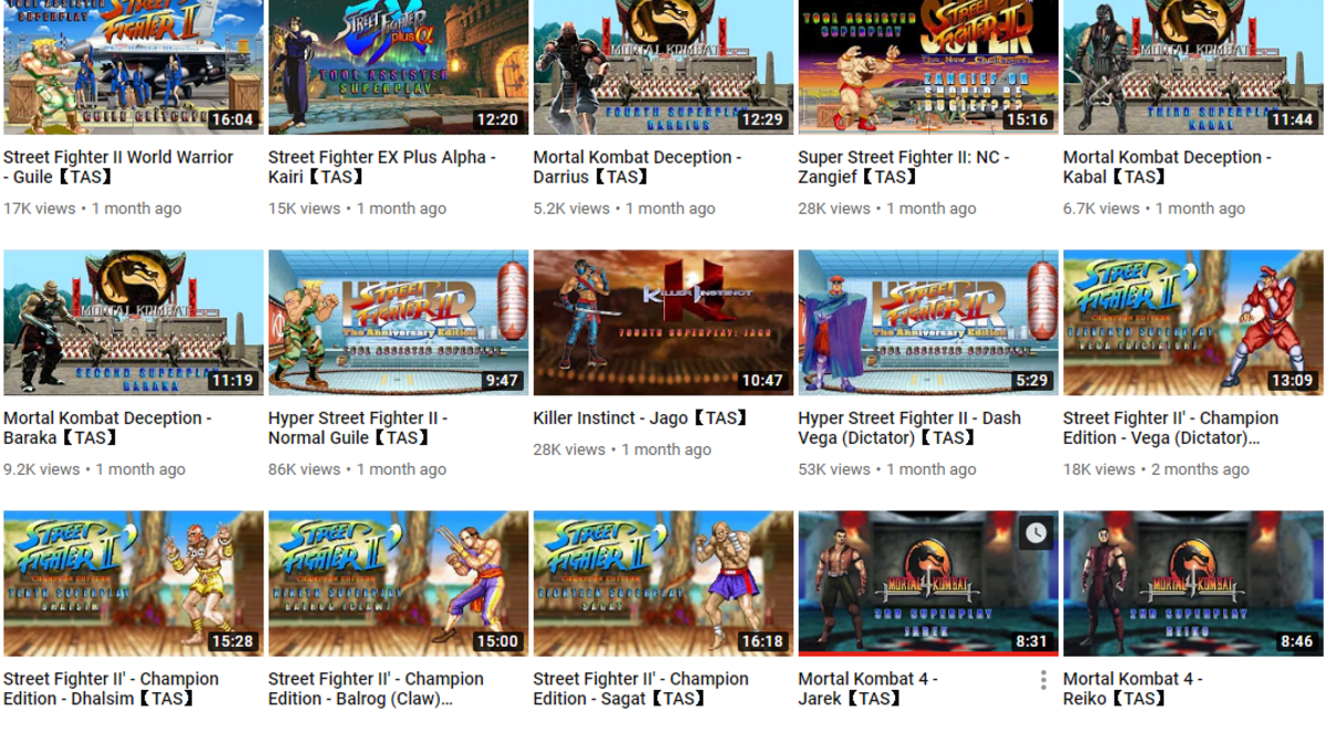
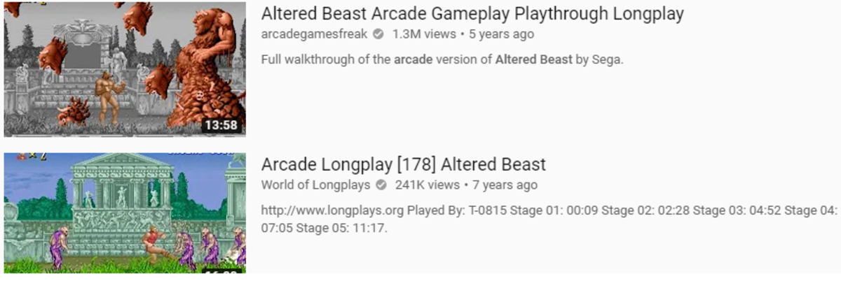
Thumbnails are going to be one of the first things others see when they stumble upon your channel. The thumbnail is going to be part of their first impression of not only that video but your channel as a whole. There are other elements, but that’s a story for another time. Most channels will have some kind of crafted thumbnails for their videos. Yet I still see a decent amount of videos that use a random image from their video. The problem with this is that you lose the opportunity to make your thumbnail unique. To add a little something of your own that’ll let people know that’s your video, and not “Random Arcade Game Video #265.” There are various ways to go about doing this. I tend to use my own characters in thumbnails, for example. You also want to come up with some kind of style or uniform design for your thumbnails that can help mark it as your own. This could be a thumbnail overlaid with text and other graphics, incorporating logos or characters into a design, or even a text thumbnail. You shouldn’t stress out too much about trying to have “Your Own Look,” though. It’s good to want to have your own look, but if you’re never actually producing because you’re afraid of not being a wholly unique… it might be time to rethink the process.
Make a Branded Thumbnail
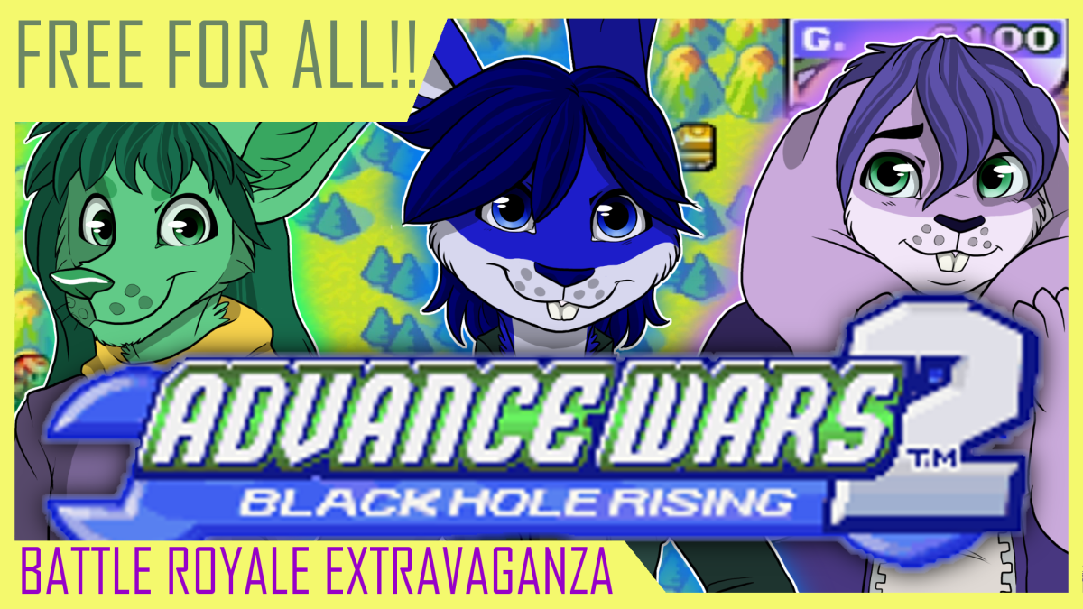
I’ve always attempted to create my own “branded image” for my channel thumbnails. I’ve gone through a few different forms in the past, too. Here’s a glimpse of how my channel thumbnails look now. There’s a bit of uniformity, and there are even a couple of different characters that pop up in the thumbnails. If you’re wondering, the blue fellow is Niko, and the green one is Razzle, and that shy purple one is Tamagi. I’ll have to give you a proper introduction to them sometime. Delving into the science for each thumbnail design would be long, so I’ll give a brief overview of what I’m doing in each. First, I went browsing around for thumbnail designs or frames to use. Most of the ones I’m using on my channel come from Roberto Blake’s YouTube Starter Kit* that you can net for $99. A bit of an investment, but it comes with not only thumbnail templates but some other cool assets as well. These include music, ways to generate video ideas, and more. As a side note, this is an affiliate link, so if you buy it, I’ll get compensated. But at no additional cost to you. I settled on the frames I use for the Razzle videos as they were small, not too in the way, and the text and borders can be recolored. Recoloring comes from a desire to create a labeling system for my videos that help viewers tell what each one is by looking at its color. So now viewers can tell which video is part of which series by a glimpse at the thumbnail design. Most arcade and Let’s Play videos have those border-style thumbnails dedicated to them. The other two thumbnail styles are for two other characters. Those two host their own video series, and rather than reuse the border-style that Razzle uses, I opted for a different style. Though the fact that the two rabbits on my channel use the Tabs is a pure coincidence. Different characters in the thumbnails serve a double purpose, though. Not only does it help reinforce the channel branding for “Niko and Friends,” but it also works into the theme of the channel. Most videos are “uploaded” by one or more of these characters that I voice myself. The character(s) that appear in the thumbnail is the “host(s)” of that video. Though Niko and Tamagi don’t talk in their videos I still try to practice voices for them. This also explains why there’s no character on the red-bordered videos. even though Razzle is the “uploader” of the videos he’s not center stage. He’s not voicing his opinions or walking the viewer through his video, only playing it to show off the required scenes. He didn’t want his big ears blocking the game screenshot, so I had to relent. These thumbnails are also a good example of taking a game screenshot and layering a design on top of it. Most thumbnails actually use in-game screenshots in some form or another. They’re framed to show off some part of the game, or at the very least something interesting. Each thumbnail also uses the game’s logo for quick and easy identification. This is where borders come in handy, as someone browsing a list of a game’s videos can now tell what type the video is without even having to read the title. Some thumbnails I’ll use other assets though, such as with the yellow-border in the example. There I took assets of my own and from Winds of Change and applied some gradient effects and then arranged things to create the desired layout. I have extra fun with the Winds of Change thumbnails as I have more freedom to play with the layout of things And now, ask yourself this question: do these thumbnails, in some way, seem unique? If you browse a list of Altered Beast or Winds of Change videos, would these look different from “Gameplay Video #265?” If so, then I did the job I set out to do. Now when you go out on YouTube and see a yellow border with some green text and a green fennec fox you’ll go “Ah, that Niko fellow.”
In Closing…
Note that this is not the only way to create branded thumbnails. As we saw with Dark Noob earlier, you can use game graphics, the game’s logo, and some text to make a style that’s still “your own.” At the end of the day, it’s about creating a style you like, and that you can reuse to help give your channel more identity. Even if someone else does something like yours…look at how many different ways people wear jeans. Always remember that you have your own twist or perspective you can add to your own designs. There might be another ‘Tuber out there using the border style thumbnails, but the addition of things like the game title and my characters still make them stand out on their own. Also, note that it’s fine to change your thumbnail design. This is the 3rd, maybe 4th whack at doing thumbnails for me. Feel free to experiment, change, and see what works for you. Part of being a content creator is always experimenting and trying out new things. Seeing what works, and discarding what doesn’t. What other kinds of questions do you have about thumbnail creation? Do you have your own ideas or tips for making some awesome thumbnails, or are you still trying to figure out how to make it work out? I’d love to hear your thoughts. Let’s get a discussion going! © 2020 Ignacio Mata


